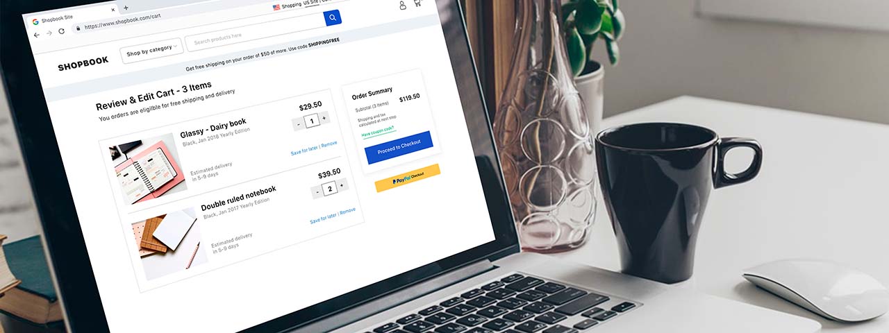
19 Tips for Optimizing your E-Commerce Checkout Page
Contents
show
Are You Neglecting Your Most Important Page?
On an e-commerce website, the checkout page surpasses every other important factor. First, the page brings you conversions; it is the place where visitors turn into customers.
Your website might have an attractive layout and a user-friendly interface. You may even have a wide range of products, but it is only good enough to increase the traffic to your website. Yes, it is essential, but none of it matters if the high percentage of your website traffic is not making it past the checkout page.
To put it simply, it means a high cart abandonment rate which indicates that people are adding items to their cart but not showing the desire to purchase after they enter the checkout section. Therefore, optimizing your e-commerce checkout page must be a priority!

Why Optimizing Your E-Commerce Checkout Page is Essential
The design of your store can make customers feel welcome and encourage them to make the first step in the purchase process. But it won’t help you convert them into customers unless you take the time to optimize your checkout page.
The checkout page is where the conversion happens. However, it can also be where customers abandon their shopping cart. Cart abandonment occurs for various reasons, and it’s a common problem for many online store owners.
According to SaleCycle, in 2021, the average shopping cart abandonment rate was 79.8%, which is 9% lower than that of 2020. Still, that means eight out of every ten people who get to your checkout page leave without making a purchase.
No matter how good their experience leading up to this, something must be going wrong – so how can you optimize the final step in a consumer’s journey for a better customer experience (and more sales)?
Businesses spend much time on other aspects of the customer experience – from their product offerings to their social media personas – but often neglect the checkout page. In this post, we’ll show you how to optimize your e-commerce checkout page to reduce cart abandonment so you can increase your conversion rates and your profit.
How to Optimize Your E-Commerce Checkout Page
Simplify everything
Even if you do nothing else, this is the big one: simplify everything. Make the checkout page clean, clear, and easy to fill in. So there are no distractions, no pop-ups (unless it’s an exit one!), and no banner ads to other sites. Some things you can do to optimize your e-commerce checkout page include:
- Allow customers to select their billing address as their shipping address rather than typing it in twice.
- Display the form categories above where they type, rather than replacing them with their text.
- If you’re going to upsell, make it non-intrusive and directly related to their purchases.
- Remove visual clutter – keep your brand image as slimmed down as possible.
- If an order doesn’t go through, make it easy for the customer to see what’s missing.
Optimize for mobile
While laptops and desktops used to be the primary source of online sales, more customers are turning towards mobile devices. Given the amount of mobile marketing, this looks set to increase steadily.
If your checkout page is not optimized for mobile, people will abandon their carts and will be unlikely to use the site again. By designing a mobile version (or app), you can ensure they stay. More importantly, they’ll remember that they had an easy time ordering from you – and are likely to order again.
Avoid video on checkout pages
While videos can improve customer experience, avoid using them on the checkout page. You might want to highlight a tutorial about what they’ve bought or show off a new product. Waiting until the purchase is complete means they’re more likely to look upon it as a positive addition, not a distraction.
Offer single sign-on
As well as creating a dedicated account on your site, you can offer the chance to use a single sign-in.
This option is a great way to capture the interest of customers who don’t want to create an account out of disinterest. By offering the chance to use a pre-existing account, you still get the data as if they’d registered, but they don’t need to remember a new account’s details.
Be clear on taxes
If you don’t already include the tax on the product page, start. Even if you display it on the product page separately and in total, it’s worth being upfront about these charges to avoid surprising the customer at checkout. While American customers are used to taxes displayed and added after purchase, it’s better to be clear on your rates, especially if you offer international sales.
Showing an estimate near the initial price would help reduce this shock for customers and encourage them to complete the purchase. For instance, many sites aimed at businesses sell products at two rates – including and excluding taxes – and show both prices. This feature is an excellent way to be clear about costs upfront.
Displaying this information is especially important for subscription plans or products with extras. For example, you might offer a base product with opt-in bonuses, and your website should be able to estimate taxes for each version.

Provide multiple shipping options
Offering free shipping is the best solution here, but it’s not necessarily possible for all businesses, especially smaller ones. So it’s worth assessing if it’s something you can provide – even if it’s only over a specific price or you bump the cost of your products slightly to adjust.
However, you can make customers’ lives easier even without free shipping. Rather than having a flat rate shipping fee, have two or three options (any more, and your customers will get decision fatigue and leave). Ideally, you want a cheap alternative that takes longer, a quicker yet more expensive choice, and potentially a more costly tracked version.
Have your checkout page default to the middle choice. By providing a cheap option, customers are more likely to complete their purchase as they can reduce the shipping costs – but they can choose to pay more for speed.
Offer guest checkout
Offering ‘guest checkout’ next to the option to register/sign-in is excellent for customers who don’t want to sign up. Whether they’re security conscious, a first-time buyer, or have another reason for not wanting to sign up, this will cover it. Rather than seeing ‘register’ and leaving the page, they can instead select ‘guest checkout’ and only provide the details required for purchase.
Remember: you can always push for them to register after making the sale. For example, create a custom thank-you page after the purchase, or use an onboarding email. As well as giving them their order number and detailing order details, you can provide them with the chance to create an account to keep track of their orders.
Provide specific delivery dates
What does “Delivery within three business days” even mean? Why are you making the user take a math test to calculate when they will get their item? Can’t you tell them when their package will arrive and cut the fuss? At the very least, say “By Xth of February,” so it is clear what the worst-case scenario is.
Make the checkout process shorter
About 18% of shoppers have abandoned a cart because the checkout process is too long or convoluted. The average checkout flow has 11.88 form elements—that’s a lot of data input. According to Baymard, the ideal checkout has seven to eight form fields—about half what the average shopper has to go through.
The longer the checkout process, the more likely someone is to leave. It’s frustrating to have spent a long time comparing products and adding them to your basket, only to discover that you have to spend even longer to buy them.
Offer single page checkout
Suppose it’s possible to display everything on a single page. Having just one page to fill in before pressing a (very clearly marked) purchase button reduces their frustration over what could be a lengthy process.
Have a progress bar
If you can’t fit it all on one page, show a progress bar so that your customers know there’s not much more left. Try to reduce it as much as possible – the example below is helpful, as it has just three sections, and one of them is ‘confirmation.’
Don’t distract the user
When the user is on their way through the journey, you want them to be laser-focused on the objective; entering all their details and pressing the “Place Order” button. Any distractions from this goal make it more likely they will be disrupted and never complete. They don’t need to be seeing your flash banners, pop-ups, cross-sell pitches, or menu buttons. You can start with that malarkey when they’ve successfully converted.
Let users jump between stages
If you use a multi-stage checkout, make sure that users can quickly return to previous stages to edit/correct their inputs, ideally by clicking on the progress bar.
You want to ensure that the user doesn’t use the browser back button to find that their previous answers have disappeared. Most e-commerce platforms have this functionality, but you should always double-check, mainly if you have built your checkout from scratch.
Use inline validation
One of the most powerful techniques you can use, inline validation, rarely fails to deliver conversion uplifts. A classic study found a 22% average improvement when implemented on forms, consistent with what we see across our client base.
For the uninitiated, inline validation is a technology that provides immediate feedback to the user rather than waiting until they submit before pelting them with error messages.
Enable address autofill
Entering your address into a form is a pain, especially if you have to input every character. Instead, it would be much better to enter your postcode/zip code and select your address from a list of options. Some sources suggest that this method could yield a 30% uplift in conversions.
Fortunately, there are many services available off the shelf (Loqate and Woosmap, for starters) that you can add to your platform, so it should be easy to implement. In addition, if you are using WooCommerce, you can add autofill functionality through a plugin.

Offer multiple payment methods
Even physical shops offer multiple payment options – usually cash, debit, and credit card. You’re restricting which customers can buy from you by limiting your payment options. While you can’t easily take cash payments, many more options are available.
One major player is PayPal. For many customers, paying through PayPal means they don’t have to go and find their card in their handbag or wallet. Reducing the need to walk away from the checkout page is a surefire way to improve their experience! Similar platforms like Stripe, Square, Amazon Pay, Apple Pay, AliPay, or Google Pay are also available.
For B2B companies, you may find that many businesses prefer the old-fashioned way of invoicing. If you can accommodate that, you’ll draw customers who might otherwise have avoided you. Several online invoicing apps can help you streamline the process.
“Tax?” “Insurance?”, “Surcharge?”, “Enhanced Shipping?”
We’ve all been there. We worked through a lengthy checkout, ready to submit, only to find a selection of charges we weren’t aware of added to our bill.
According to Baymard Institute, 49% of customers cite extra costs as their primary reason for abandoning shopping carts, with shipping a primary driver of those costs.
Don’t be one of those sites unless you want a significant abandonment rate on the commitment step. If you charge shipping or have to add taxes on top of the price, make sure you quote them early on so the user can mentally account for the additional costs. Ideally, bundling these charges into the product prices would be best, so the customer never sees the “add-ons.”
Use trust badges
Customers can get sensitive when they are about to part with their credit card details. If their gut tells them that your website is not trustworthy, they may abort the transaction at the last minute, not trusting you to deliver what you promise.
One of the best ways to mitigate this is through trust badges – third-party authentication that you are a reputable site. But be aware that not all consumers recognize trust badges.
Don’t overuse coupons/discount codes
At first blush, discount coupons can seem like a great idea. Drive new users to your site and use price to convert them.
Not so fast.
What’s the first thing most people do when they see that juicy discount code box just before they’re ready to buy? That’s right. They get straight to Google and hunt for a code to save themselves some money. This behavior leads to three potential outcomes:
- They find an applicable discount code and progress with the purchase. You still get the sale, but you have lost margin.
- They can’t find a discount coupon (or find one that your site won’t accept). Customers grudgingly complete the sale but are annoyed at the time they have wasted.
- They get so frustrated because they can’t find a code, so they leave the process altogether, costing you a sale you would otherwise have made.
These scenarios differ in the severity of impact on your business, but they are all negative. You want to avoid them if you can. Try one of these options instead:
- Always give the user the best available code and ensure they know it. That way, they will never search elsewhere.
- Use pre-discounted links rather than a voucher code box. Then users who don’t have a discount won’t know what they’re missing.
- Hide the coupon code field behind a button. Make it less evident that there are discount codes available.
- Host your offers so the users know where to find discounts if they are available.
- Change the language you use. For example, Amazon emphasized “Gift Cards” rather than “Promotional Codes” to reduce expectations of a “free” discount.

The Benefits of Optimizing Your E-Commerce Checkout Page
Optimizing your e-commerce checkout page is not restricted to some fixed strategies. You will find plenty of ways to optimize your checkout page. However, I found the above-suggested methods to be the most beneficial. But optimizing the checkout process is not as easy as it seems.
Therefore, never stop optimizing your store. As new developments continue to arise in the industry, customers will favor sites that keep improving and offering an enhanced customer experience.
Once you can provide visitors with a quick way to shop for their favorite goods at great prices and with no hidden costs, they will be inclined to complete their purchase and return again and again.
By following these 19 simple tips, your customers will have a much simpler – and more pleasant – checkout experience, and you’ll see less cart abandonment.

We Can Help You Optimize Your E-Commerce Checkout Page
Do you want to create a functional, thoughtful, and user-friendly checkout process for your online store? Our team of professional designers will be happy to help you with this. But, first, look at our portfolio and read our case studies.
Then, if you believe we are a good fit for your web design needs, let’s talk! We offer a full range of consulting and design services for businesses and product brands, including custom web design and development, e-commerce solutions, website redesign, multilingual web design, search engine optimization, and WordPress optimization.

And if you are still not sure how to optimize your e-commerce checkout page, let’s talk! Our team will listen to you, answer your questions, and determine the best way to meet the user expectations of demanding mobile consumers. It is one of our specialties, after all!
Did You Optimize Your E-Commerce Checkout?
Tell us about the checkout page on your website. What have you done to improve it? Does your online store provide a smooth checkout process? Feel free to add any point you feel can help provide a seamless checkout experience.
Please leave your comments below so our audience can benefit as well. Grab our feed, so you don’t miss our next post! And help other business owners optimize their e-commerce checkout process by sharing this post with them!
Thank you! We appreciate your help to end bad business websites, one pixel at a time!
By Gregor Saita
Co-Founder / CXO
@gregorsaita